Case Study
Wikiloc Design System
Scalable design system for Wikiloc
 Xavier Morros
 Jan Berkel
 Roger Tallada
 Jose Molina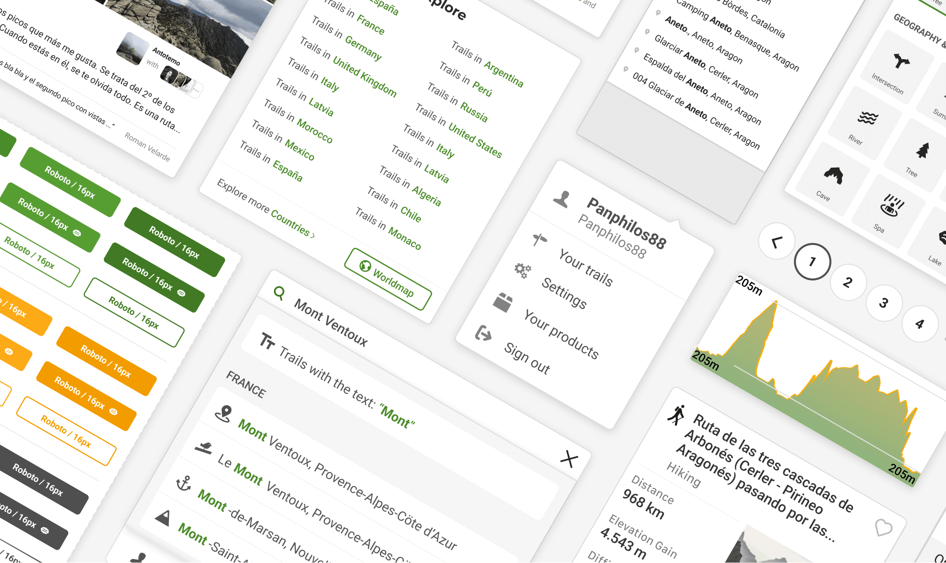
The problem
Wikiloc launched 16 years ago with a strong technical focus, and many designers and developers had touched the product without ever documenting its patterns. The result was a deeply disaggregated interface: inconsistent components across platforms that hurt both development efficiency and the experience for users.
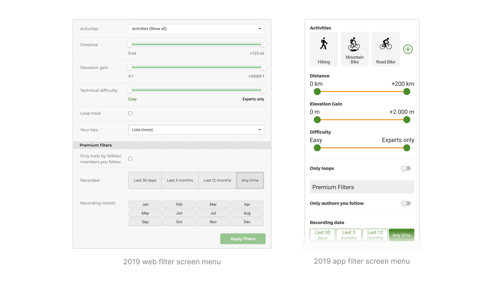
Web and app filter controls had drifted apart over the years
Foundations
After getting buy-in from a sceptical management team, I ran a full interface inventory across platforms, then laid the foundations for the system: Wikiloc's grounding values (inclusivity, trust, authenticity, nature preservation), its purpose, and three design principles (legibility, simplicity and consistency) to guide every decision that followed.
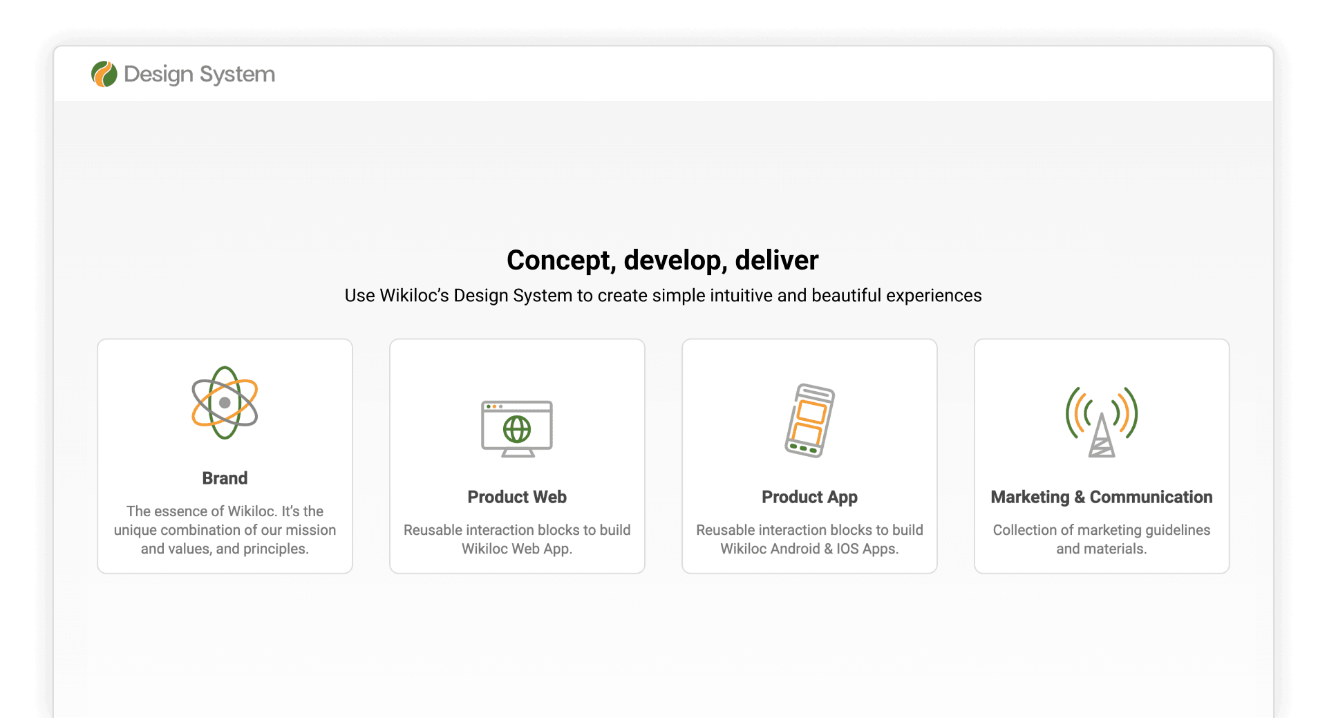
The Design System's documentation site, built at design.wikiloc.com
Governance & impact
I organised the system around perceptual, functional and marketing patterns, forked into web and app libraries to reflect each platform's particularities, and documented everything so the whole team could contribute. A lightweight, five-step governance process, inspired by Atomic Design, now keeps the system evolving without heavy overhead, letting a small team ship consistent, on-brand experiences faster across every platform.