Read next
CASE STUDY
Improving the Exploration at Wikiloc
Better trail discovery and recommendations
 Xavier Morros
 Jose Notario
 Kai
Kai Mònica Follana
Product DesignResearchAI Prototyping
CONTEXT
Content discoverability: a key driver of Wikiloc's growth
As product designer, I led the discovery and design work in close collaboration with product, data, engineering, support, and company leadership. My role covered user research, information architecture, concept testing, interaction design, and the definition of a scalable landing-page system.
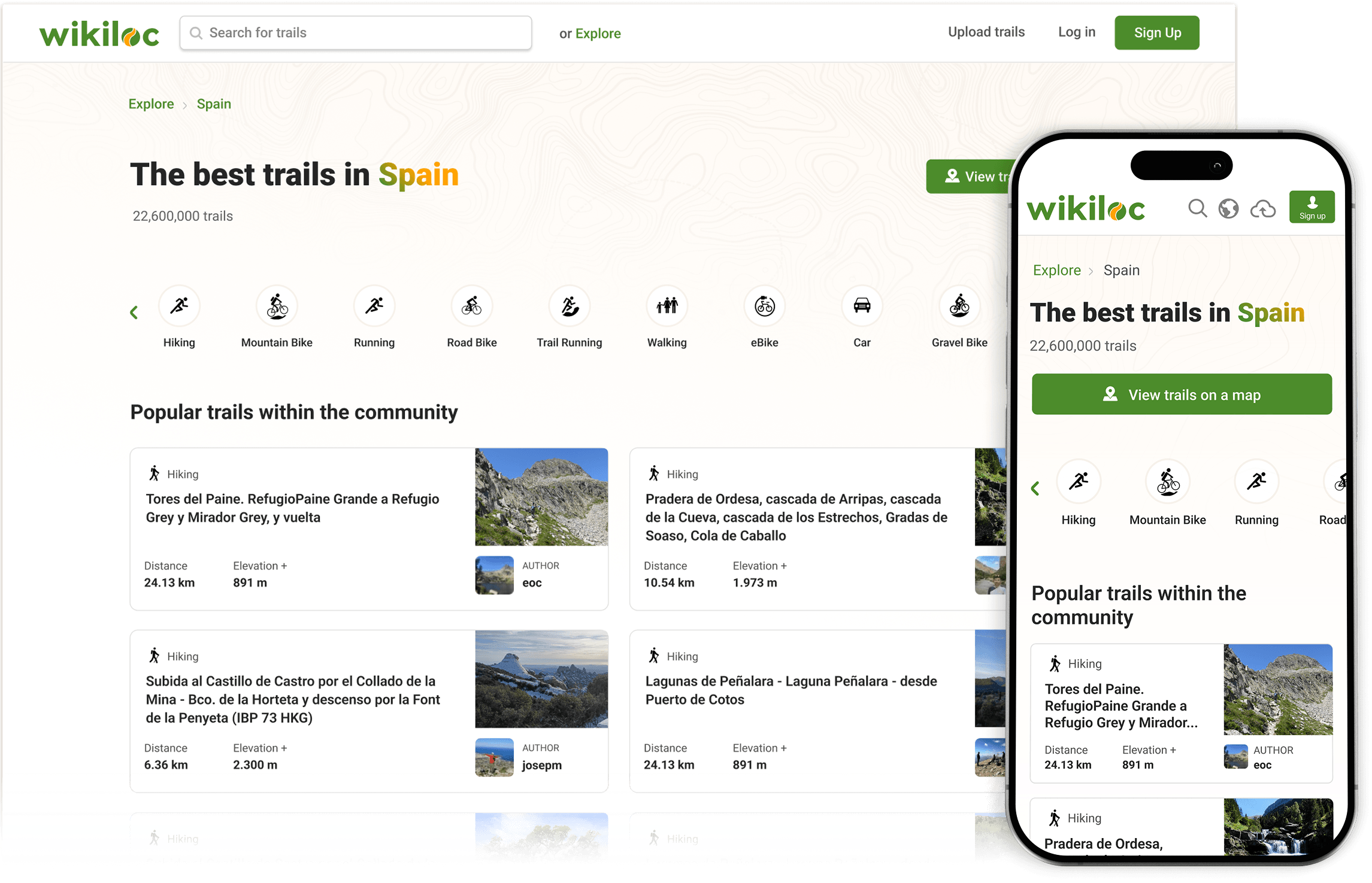
Web-to-app traffic was a key driver of Wikiloc's growth. For many users, the first touchpoint with Wikiloc is a trail search through a search engine or AI service, followed by a visit to one of Wikiloc's SEO landing pages. Well-optimised landing pages are therefore critical for attracting relevant traffic to Wikiloc.
Wikiloc's landing pages are generated programmatically and organised through a hierarchy of geographic entities: countries → regions → places. This produces tens of millions of activity-and-location pages targeting searches such as “hiking trails in Paris” or “MTB trails in Madrid”.
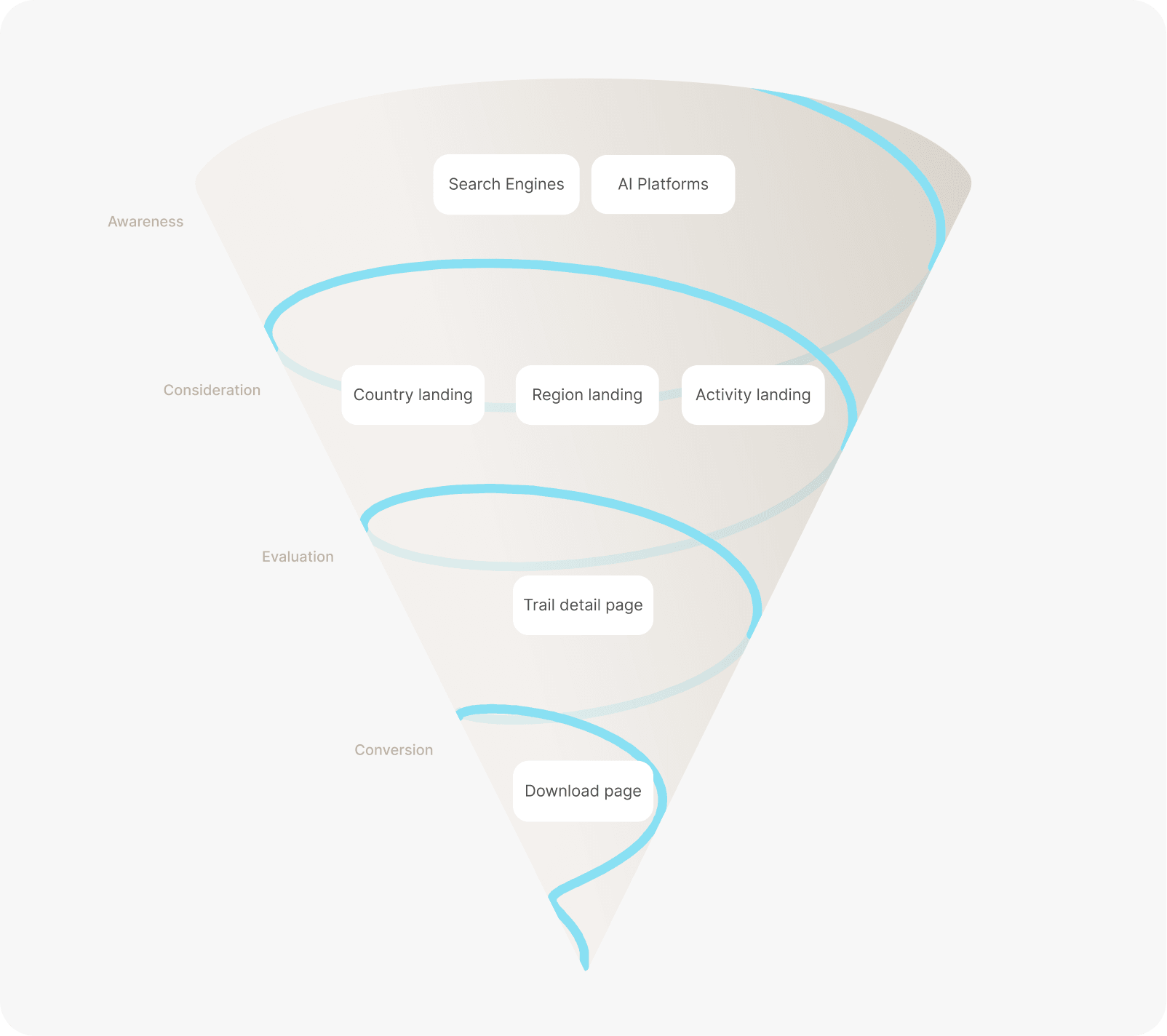
Wikiloc's acquisition journey, from search visibility to app conversion
THE OPPORTUNITY
Leveraging new growth opportunities
Some Wikiloc stakeholders believed that users had content-discovery needs that were not being addressed.
In particular, potential new users arriving from search engines and AI services were looking for trails passing through points of interest (POIs), such as Mont Blanc or Blue Lake. At the time, Wikiloc did not have POI-focused landing pages, which meant missing a potentially valuable source of organic traffic.
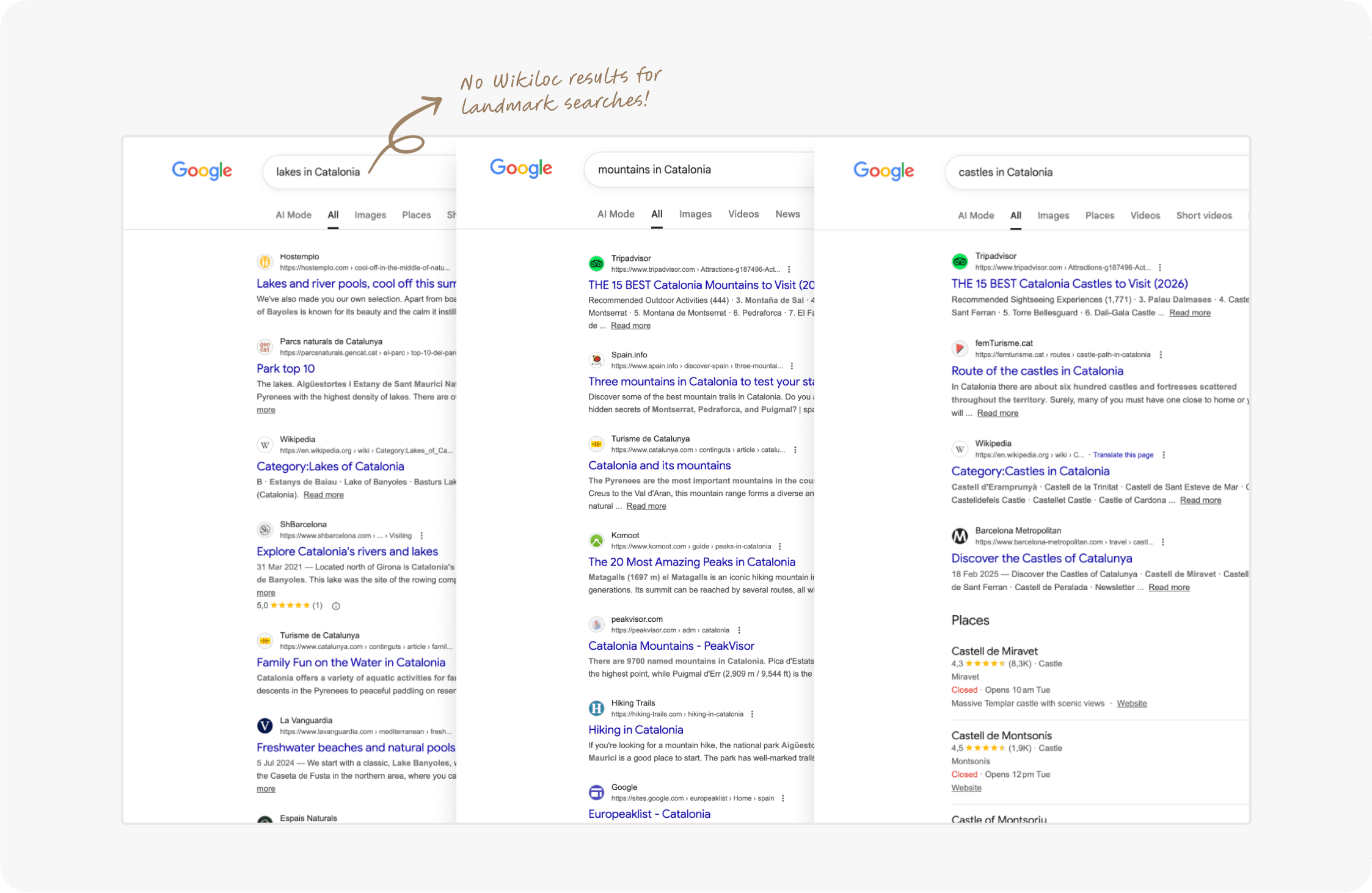
Search results for POI-related queries in which Wikiloc was absent
Working closely with my product manager, I shaped an initial strategic proposal around a primary Job to Be Done: helping POI-seeking users find relevant trails.
The high-level goal was to improve content discoverability across search engines and AI services, supporting the full web-to-app conversion journey: sign-ups, downloads, trials, and subscriptions.
DISCOVERY KICKOFF
Gaining insight into the problem space
Although I had an initial hypothesis to explore, I first needed a broader understanding of how people discovered content across Wikiloc. One critical question guided the discovery phase: were POI pages the real opportunity, or one symptom of a wider findability problem?
To answer it, I investigated what users searched for, how they discovered relevant trails, and how they browsed and interacted with Wikiloc's content when planning an outdoor activity.
#1. Understanding how users find content on Wikiloc
I recruited six active Wikiloc users and interviewed them to better understand how they searched for outdoor activities.
Analysing the main observations through empathy maps revealed several recurring themes:
“Once I'm in a place, I search for interesting spots to visit in that area.”
“I try to make sure the trail passes through natural landmarks such as rivers or lakes.”
“I search for trails near my city, such as trails in Barcelona or trails in Madrid.”
“Once I'm in a place, I search for trails that pass through popular places.”
These conversations formed the following key insights:
Exploratory seeking
Users may know the type of activity or general area they are interested in, but lack enough context to make a precise search. Wikiloc did not provide an effective way to explore content when the destination was still open-ended.
Known-item seeking
The most common scenario occurred when users already had a place in mind and wanted to reach relevant content quickly—for example, “hiking trails in Barcelona”.
Different search particularities
Some users searched not only by location, but also for routes passing through landmarks or specific points of interest. Wikiloc did not provide reliable results for these searches.
On the spot search
Some users began searching only after arriving at a destination. In these situations, discovery was highly contextual and focused on nearby options.
#2. Understanding what users search for
Once I understood how users searched on Wikiloc, I needed to identify the types of content they were looking for. This quantitative analysis complemented the interview findings.
The data manager extracted the top 1,000 queries from Wikiloc's internal search and the leading organic queries from Google Search Console. I used AI to help classify each query by search-intent type.
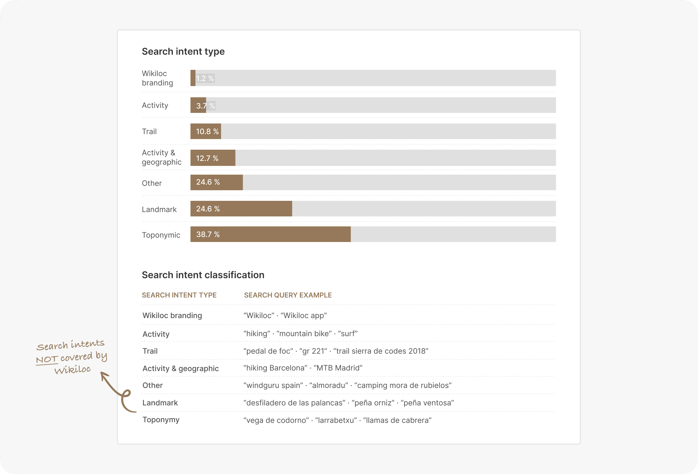
Search-intent categories from queries that led users to Wikiloc
The analysis showed that users arrived at Wikiloc through searches related to:
Landmarks
Users looked for trails passing through generic geographic features such as rivers, caves, or lakes.
Points of interest
Users struggled to find trails passing through specific places such as Pic du Midi or Mont Blanc.
Place names
The largest group of queries included place names such as Barcelona or “trails in Madrid”.
Wikiloc brand
Some users searched directly for Wikiloc or the Wikiloc app, indicating existing brand awareness.
This confirmed the initial hypothesis that Wikiloc did not adequately serve some important search intents, as the product had no POI- or landmark-focused landing pages.
#3. Assessing Wikiloc’s content structure
I also needed to understand how this new content could fit into Wikiloc's existing information architecture, so I took the initiative to run a tree test after each interview using Usabilitree.
The goal was to assess content findability across the existing website. Participants were asked to locate trails in different places using the site's content hierarchy.
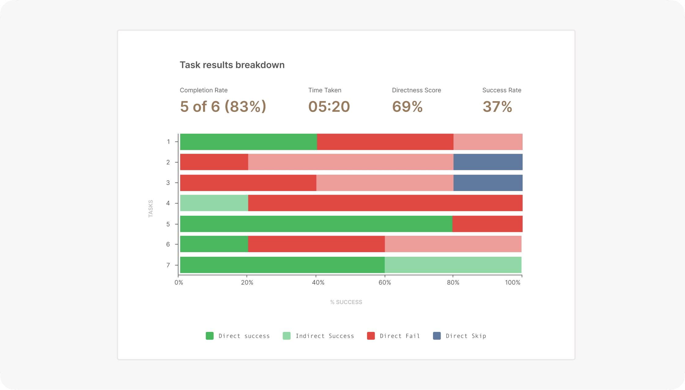
Tree test to assess Wikiloc content structure
The test showed that most participants struggled to complete the proposed tasks. After analysing the results with the team, I formed the hypothesis that the underlying issue was the site's content structure. I therefore audited Wikiloc's information architecture.
The audit revealed two fundamental issues with the way trail content was organised:
A structure that was too deep
To reach a specific place, users first needed to know its country and region. This made unfamiliar destinations particularly difficult to find.
An organisation that was too narrow
Content could only be explored geographically, preventing users from discovering it through landmarks, activity types, or other meaningful relationships.
REFRAMING THE PROBLEM
The opportunity was bigger than POI landing pages
User interviews and search analysis reinforced the initial hypothesis: Wikiloc was not surfacing some of the content users were actively looking for.
However, the tree tests showed that the problem went deeper. The content structure was both too narrow and too deep, making relevant pages difficult to reach.
Together with the product manager, I reframed the original POI opportunity as a broader content-discoverability challenge.
With this in mind, a crucial question emerged:
How might we help people discover relevant outdoor content, even when they do not know exactly what to search for?
This became the core challenge. Wikiloc did not offer users a seamless way to explore and discover content, so I needed to rethink more than a single type of landing page.
SETTING THE VISION
Figuring out what to build
Based on these findings, I believed the answer did not lie in adding chatbots or questionnaires, but in improving Wikiloc's existing information architecture.
Working closely with the product manager, I defined three strategic directions and presented them to the wider team for validation:
#1. Add POI and landmark-based organisation
Expand the existing geographic model so users can reach trails through landmarks and specific points of interest.
#2. Improve the exploration experience
Help users who do not yet know exactly what they want to find by presenting relevant and popular options within the same geographic area.
#3. Improve Wikiloc's content structure
Create clearer relationships between countries, regions, places, activities, and POIs so users can navigate across the site more naturally.
THE FRAMEWORK
Setting the design direction
I worked closely with the CEO, product manager, and engineering team to progress from low- to high-fidelity explorations, drawing on competitor analysis and information-architecture patterns from adjacent industries.
Ongoing communication and collaboration were essential. I also checked in regularly with the support team to compare the proposals with the concerns and suggestions they had received from customers over time.
Benchmarking exploration patterns across competitors
Before proposing changes, I analysed how other outdoor platforms organised content on their exploration pages: where they placed key actions, how they created visual hierarchy, and how their wayfinding helped users reach relevant content.
This allowed me to identify several areas where Wikiloc's content strategy and presentation could be improved.
Weak visual hierarchy
Important content, imagery, and actions did not stand out clearly enough.
Lack of content variety
Competitors offered more ways to explore content by theme, activity, place, and point of interest.
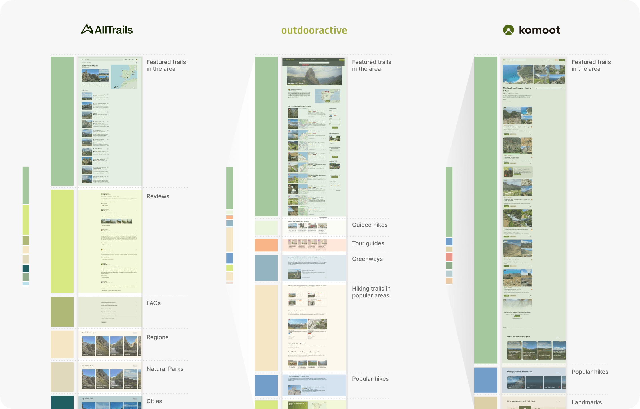
Functional content mapping
A top-down approach
One of the first major design challenges I faced was deciding how to introduce the new exploration and POI pages into a fragmented information architecture.
The product manager and I began by redefining the content architecture at a system level. Once the relationships and user flows were clear, I moved on to the interaction and layout models for the new exploration experience and POI-focused landing pages.
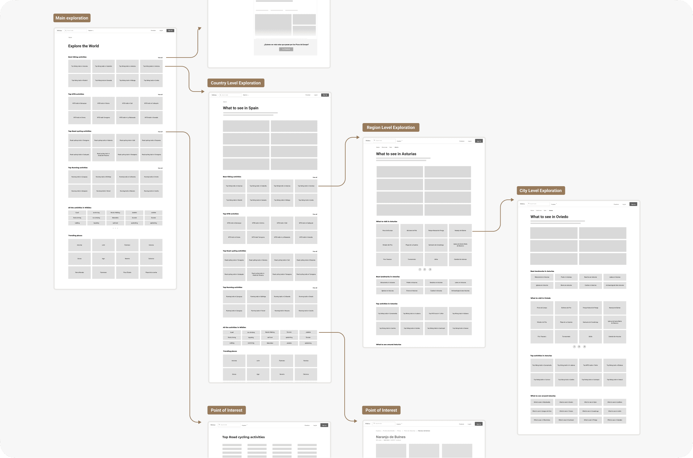
Connecting exploration pages across country, region, city, and POI levels
Testing early prototypes
I ran a series of concept tests on early prototypes to build a better understanding of the needs and pain points to address, focusing on the most significant change: the new Exploration page. To test the concept with users, I built a quick functional prototype that brought the emerging information architecture and interaction model to life.
Functional prototype used during early concept testing
I explored different arrangements of UI, functional, and data elements, as well as the interactions connecting them. Starting broad allowed the vision to evolve into a tangible design language and a consistent anatomy for the new pages.
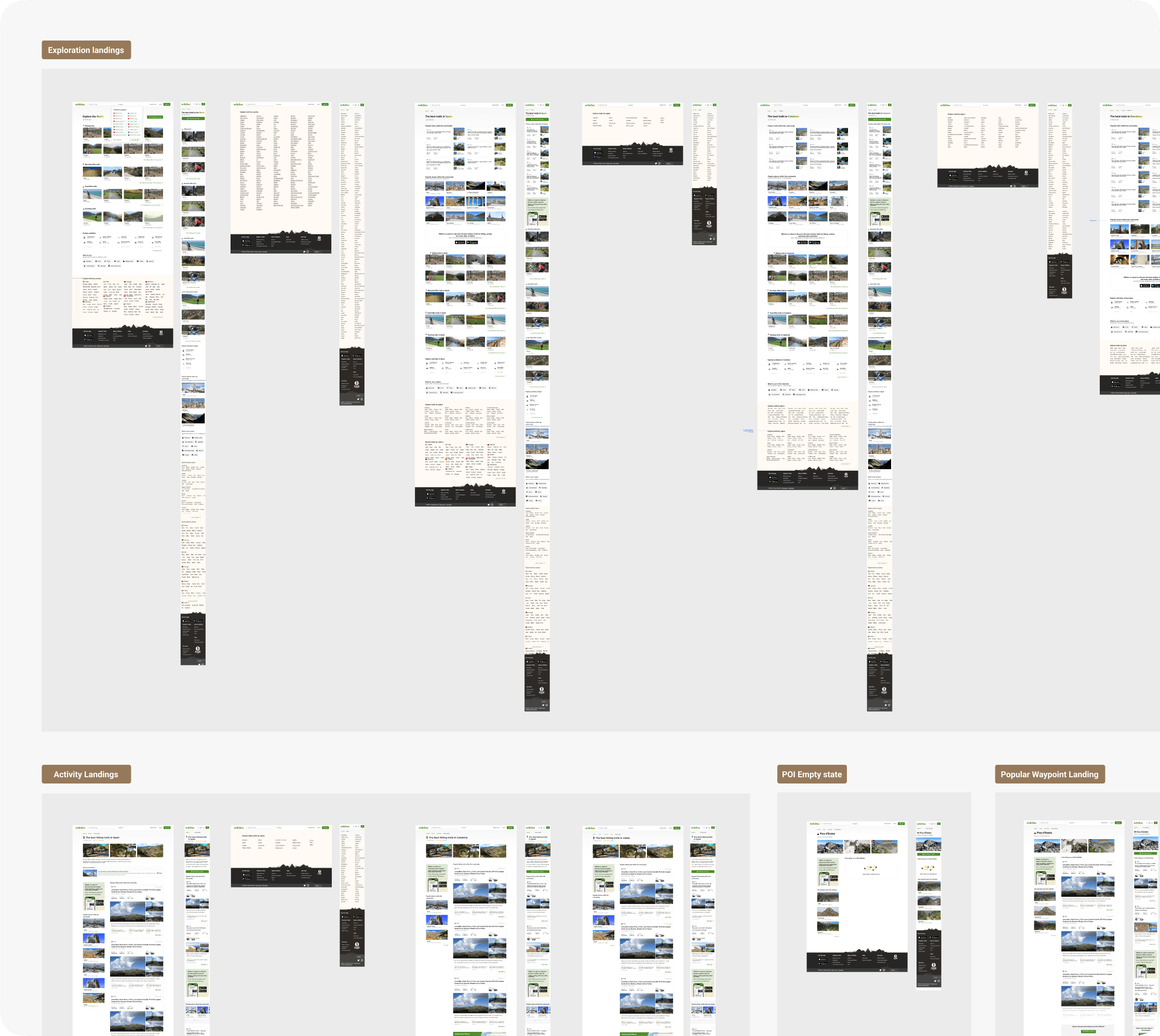
Selected visual explorations for the new landing-page system
A many-legged creature
The confidence with which I initially defined the problem and outlined an end-to-end proposal proved slightly naive. As the work progressed, I uncovered a system with many connected parts and dependencies:
- The architecture had to scale across country, region, city, activity, and POI pages.
- New relationships between trails, locations, and landmarks had to remain understandable to users.
- The same patterns needed to work consistently across desktop and mobile.
- SEO requirements, content taxonomy, reusable components, and engineering constraints had to evolve together.
The design system saw a flurry of updates during this period. I used the opportunity to consolidate new UI—including trail and waypoint cards—along with reusable interaction patterns.
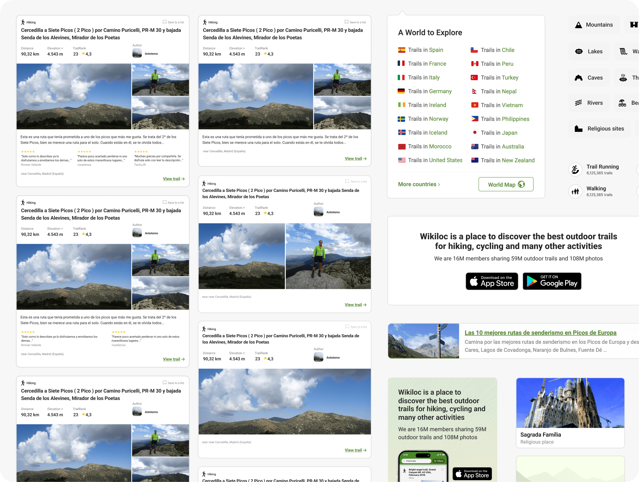
Design system updates
SOLUTION
One exploration system, multiple ways to discover
The final solution expanded Wikiloc's geographic hierarchy into a broader exploration system. It connected countries, regions, cities, activities, and points of interest, allowing users to move naturally between different levels and discover relevant trails even without a precise query in mind.
Making geographic pages useful for exploration
I redesigned the geographic landing pages to go beyond lists of trails. Activity filters, community favourites, popular places, and map access offered different starting points while preserving the strong location context that already supported organic search.
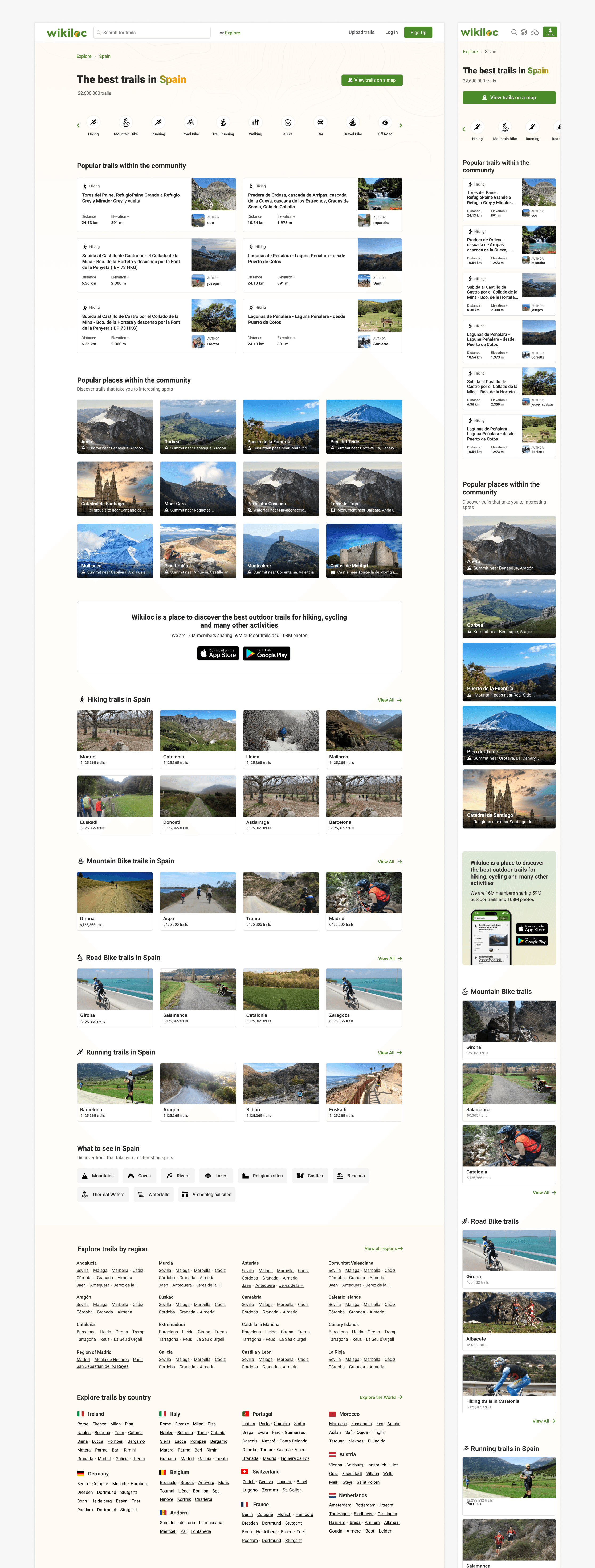
A geographic landing page combining direct trail access with exploratory content
Turning points of interest into discovery gateways
The new POI-focused pages connected landmarks with nearby places and trails passing through them. This addressed an unmet search intent while giving users the context they needed to evaluate an unfamiliar destination.
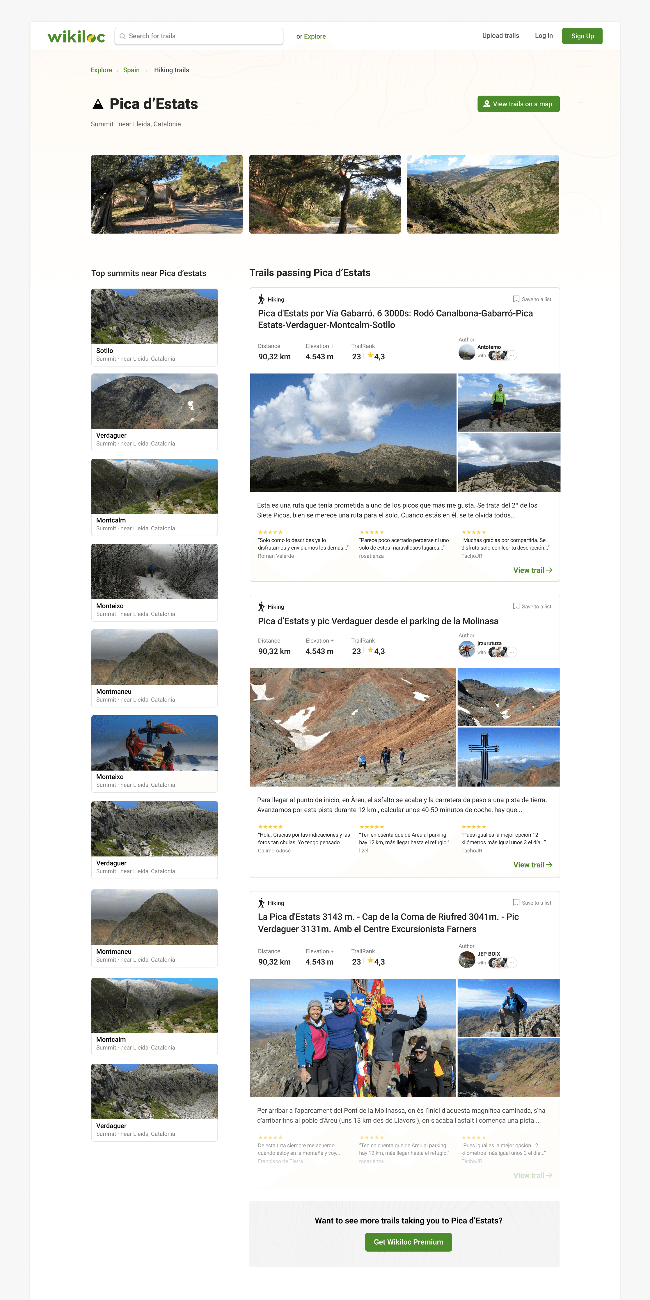
POI-focused landing page connecting a landmark with nearby summits and trails
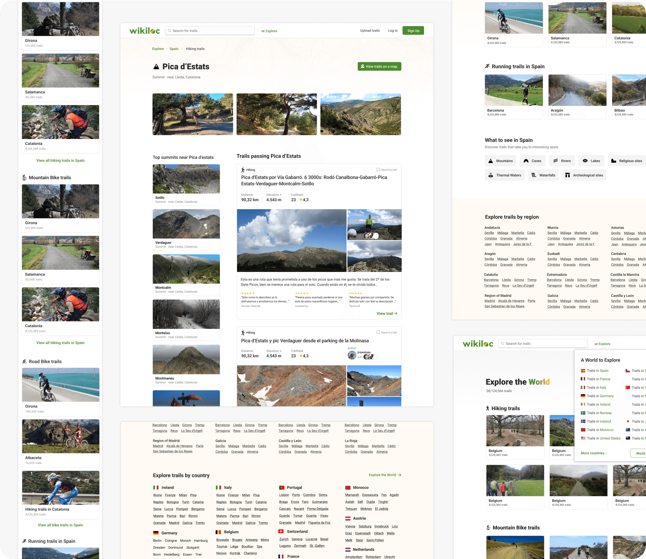
The wider exploration system across POI, activity, regional, and global landing pages
IMPACT
Expanding organic reach and shortening paths to content
After launch, the new POI-focused pages created dedicated destinations for landmark and POI searches that Wikiloc had not previously served. This expanded Wikiloc's organic footprint and produced a measurable uplift in traffic across the newly covered search intents.
Organic uplift across newly covered POI and landmark searches
Broader coverage through a new content category for underserved search intents
Lower navigation depth with more direct paths to relevant trails
*Exact figures and absolute volumes have been withheld to protect confidential business data.
At product level, the new information architecture created more direct paths to relevant trails and established a scalable foundation for future landing pages, activities, and geographic entities.
FINAL REFLECTION
Discovery reframed the opportunity
One of the main learnings from this project was the value of investing time in discovery before jumping to solutions. The initial hypothesis pointed at a missing content type (POI landings). But the real problem was broader: the content structure itself was limiting users' ability to explore.
Without the user interviews and tree tests, I might have designed a solution for a symptom rather than the underlying issue. The discovery phase gave me the confidence to propose a more systemic change—one that the team and stakeholders could align around.
It also reinforced something I carry into every project: framing the right problem is often more valuable than immediately executing a solution. Once the problem was clearly defined, the design decisions became much more focused.