
Building user confidence
Showing users that the route they are planning follows real trails previously recorded by the Wikiloc community.
CASE STUDY
Designing one of Wikiloc's top-converting Premium features
 Xavier Morros
 Roger Tallada
 Jordi Ramot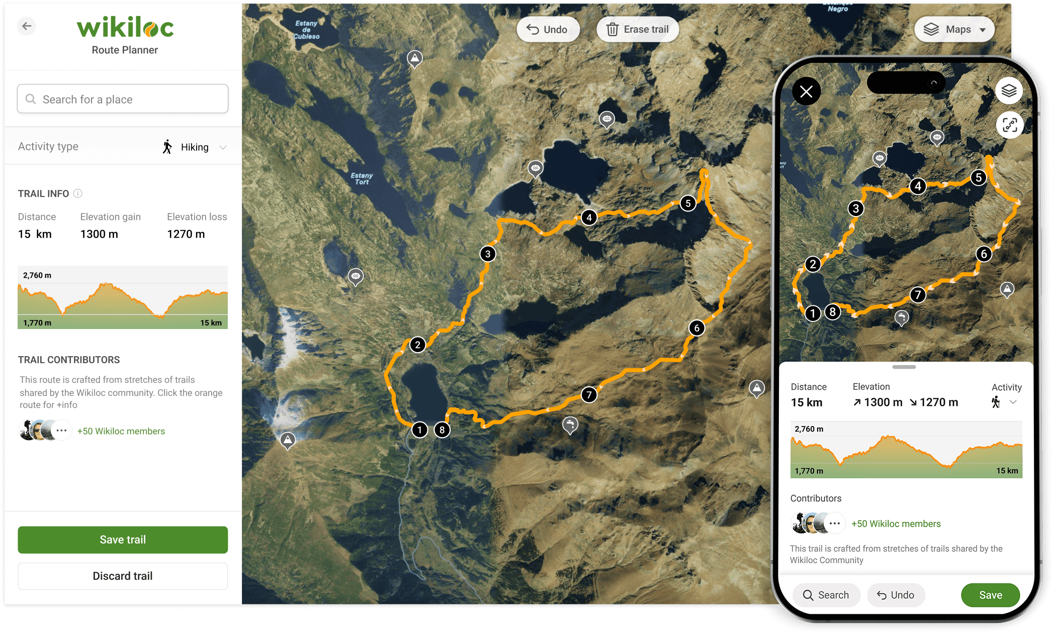
PROBLEM
After keeping the Premium subscription at the same price for many years, the business needed to introduce a significant price increase. This was a risky move, as our community would be unlikely to accept it without a meaningful increase in value.
At the same time, we had noticed a small but steady flow of users moving to other platforms because of the lack of a proper Route Planner—an essential feature in our market. The existing tool, unchanged since 2012, failed to meet user expectations.
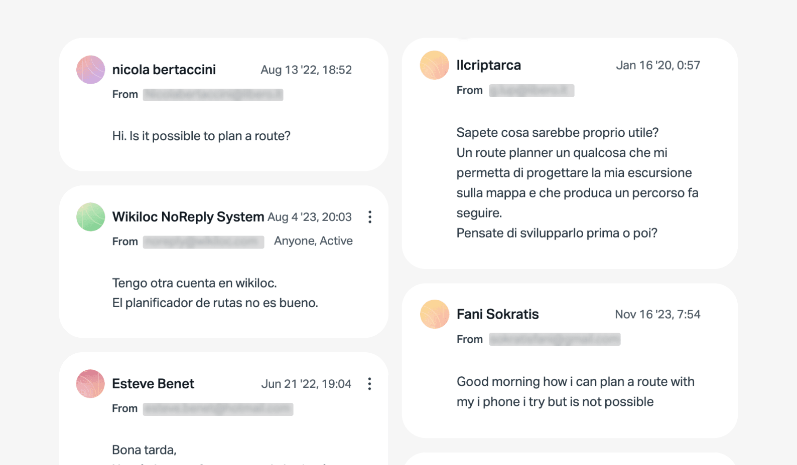
Hundreds of users asked us for a new Route Planner
GOALS
Our ambition was to build a route-planning tool that increased Wikiloc's value by addressing long-standing pain points and unmet user needs, while also supporting the business. Our high-level goals were to:
DISCOVERY KICKOFF
Before moving forward, we needed to gain a deeper understanding of our users' entire planning experience.
"How do Wikiloc users plan their trails?"
Understanding how Wikiloc users planned their trails was the most important question to address at this stage. The discovery phase allowed us to define project milestones, audit the existing work, review the competitive landscape, and begin researching user needs, behaviours, and pain points.
RESEARCH
I recruited eight active Wikiloc users and conducted interviews to gain deeper insight into how they planned a trail. I wanted to understand our users' needs, motivations, fears, and pain points when planning an outdoor experience.
Synthesising the most important points and observations from the interviews using empathy maps revealed a few common themes:
I'm concerned about planning trails through difficult terrain.
I'd like to avoid planning trails by adding each point manually, as I don't know the shortest paths between points.
It would be helpful to have more detailed maps while planning.
I would like to see photos along the trail to understand what I'll find once I get there.
These formed the following key insights:
Safety
The main concern when planning is whether a trail is feasible. Users want to avoid risks such as exposed paths or crossing private property.
Efficiency
Users want the shortest possible path between two points. Avoiding unnecessary detours and excessive elevation gain is essential.
Awareness
Users often have limited knowledge of the area where they are planning, although they may recognise some topographic features.
Experience
Visiting notable landmarks along a trail is one of the main motivations for an outdoor activity.
Area
Users often follow trails close to where they live.
Timing
Users plan in advance, usually between one and five days before following a trail.
PERSONAS
Based on the interview insights, we defined three distinct user archetypes. These helped us stay aware of users' goals, motivations, and pain points when planning outdoor experiences.
"We used personas throughout the project to guide design decisions, set priorities, and build empathy across the team."
The personas became a valuable resource during feature ideation. We used them throughout the project to guide design decisions, set priorities, and create a shared understanding of the challenges users faced when planning a trail.
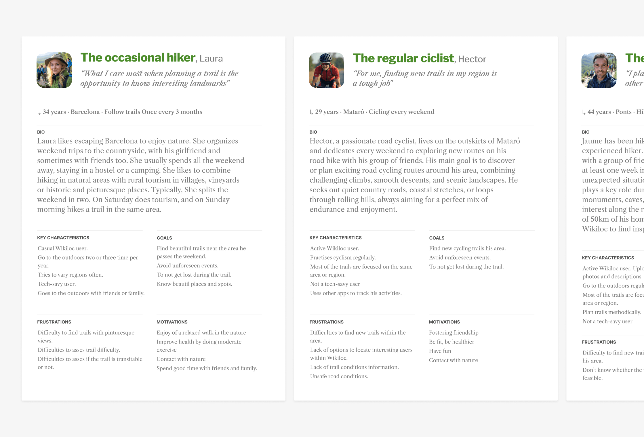
Three user archetypes representing different levels of outdoor experience
MAPPING THE EXPERIENCE
I used user stories to narrow down the key issues experienced by our personas. This gave us a solid starting point for defining what the product should achieve and helped keep the team aligned around specific user needs.
As an occasional hiker, I want to find relaxing and scenic routes in nature.

The occasional hiker, Laura
As a regular cyclist, I want to find new cycling routes in my region, organize them and track progress of stored activities.

The regular cyclist, Marc
As an experienced hiker, I need to find new interesting trails, and be sure that they are clear and safe.

The experienced hiker, David
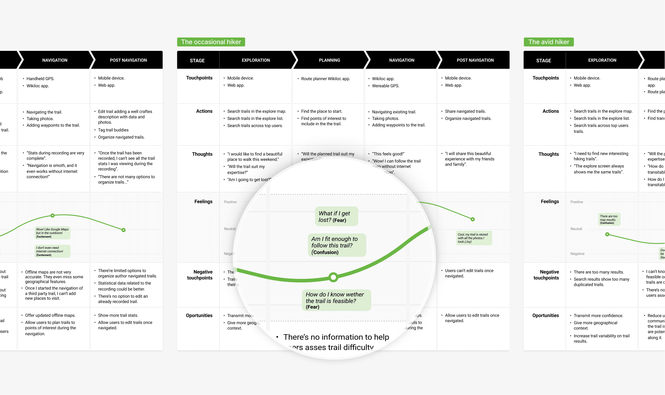
I then mapped the current-state journeys of all three personas across the app. This allowed us to visualise their pain points and identify where we needed to focus our attention.
Reframing the problem
The journey mapping revealed that all three user archetypes experienced difficulties at the same stages.
Users could not properly anticipate what a planned trail would be like, creating uncertainty and fear of the unknown. This was mainly caused by a lack of relevant information and context during planning.
"How might we help Wikiloc users to plan outdoor trails with peace of mind?"
This led us to ask: how might we help Wikiloc users plan outdoor trails with peace of mind? We saw a significant opportunity to reduce uncertainty throughout the planning process.
THE VISION
After gathering user insights, the next step was to determine which Route Planner features to prioritise. I used Indi Young's mental model framework to map what users do before, during, and after planning.
I grouped these activities by behavioural affinity and aligned them with relevant content and potential features. This helped us visualise which capabilities would be most useful and identify opportunities to innovate.
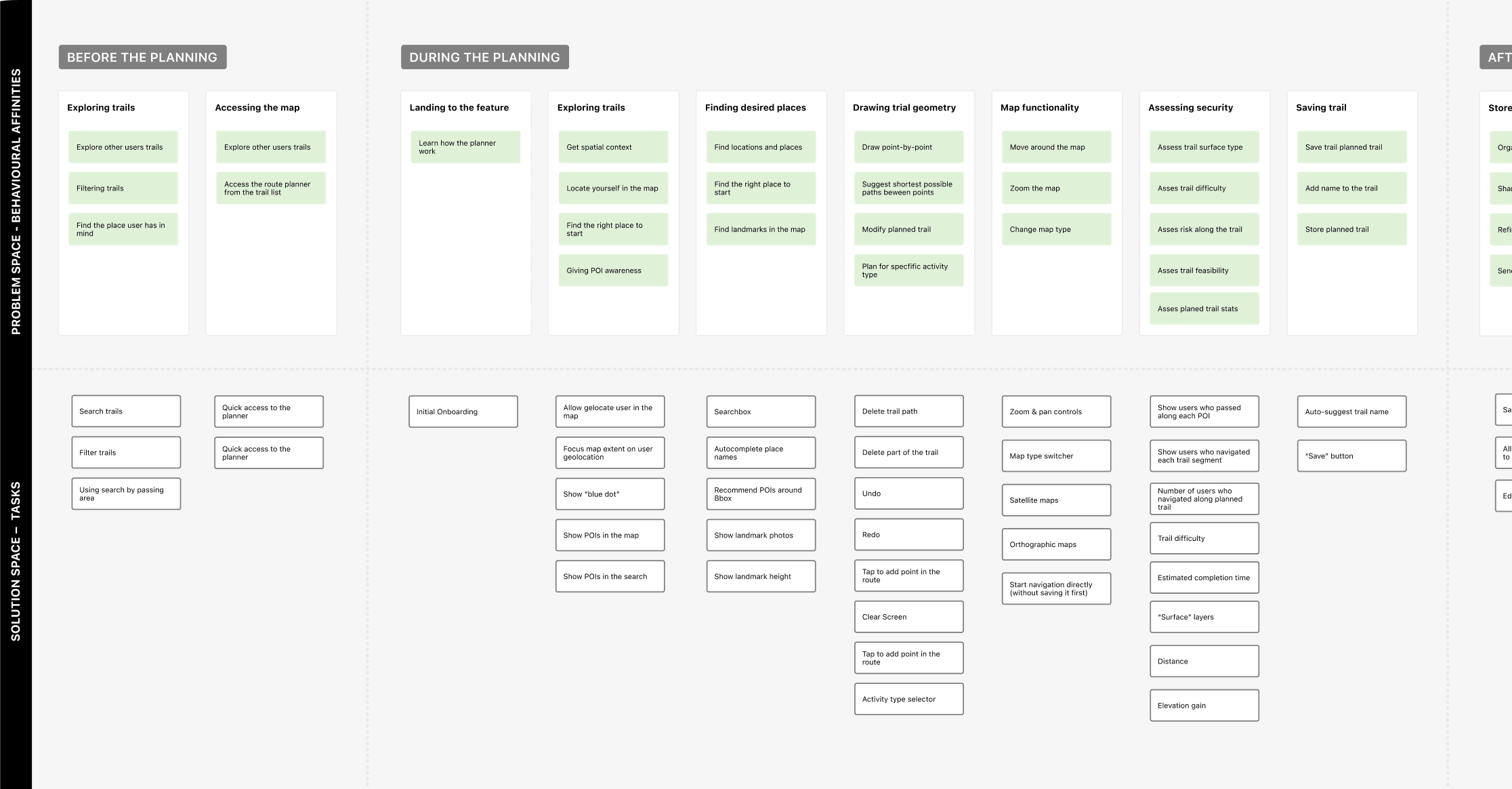
Mental model connecting user behaviours with product opportunities
Next, I collected the ideas in a spreadsheet and proposed a prioritisation based on our personas' needs, technical feasibility, and business objectives. In subsequent sessions with the CEO and engineering team, we agreed on the final priorities using the MoSCoW method.
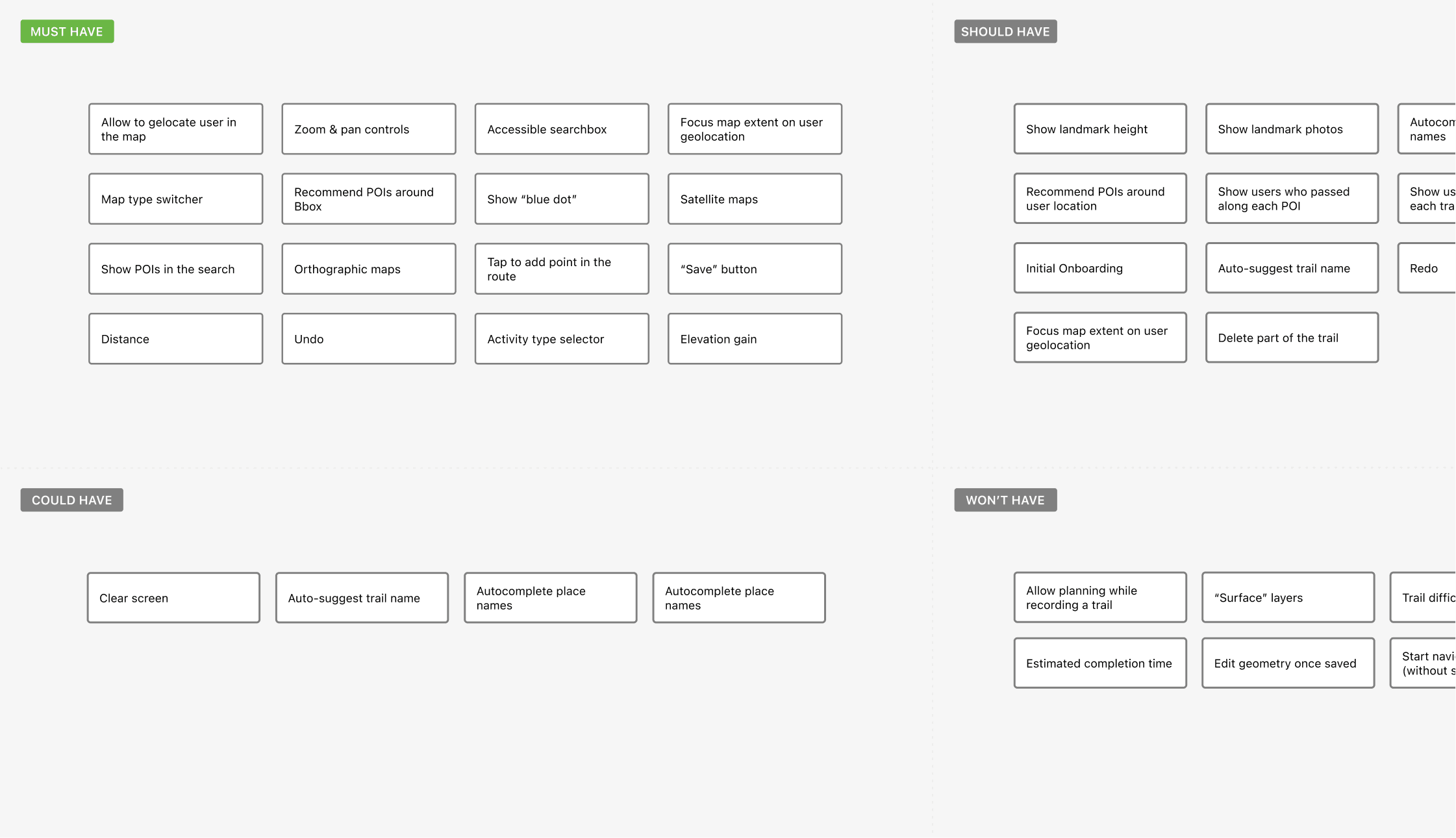
MoSCoW feature-prioritisation diagram
DESIGN DEFINITION
While our competitors focused on offering a wide range of planning features, our vision centred on one key idea:
To enable our users to enjoy their outdoor experiences with peace of mind.
Reducing fear, confusion, and anxiety around an upcoming outdoor experience became a principle that guided our design decisions. Following this core idea, I established a set of principles that would guide further designs.
Showing users that the route they are planning follows real trails previously recorded by the Wikiloc community.

Finding the right balance between keeping the planning experience as simple as possible and providing the functionality users need.

Giving users enough geographic and topographic information to make confident decisions about unfamiliar areas.
With a “no bad ideas” mindset, I sketched rough solutions for the prioritised features and began exploring the information architecture and key interactions.
These initial sketches were crucial for gaining early stakeholder buy-in and feedback. I ran two fat-marker sketching sessions with the CEO, an iOS engineer, and a platform engineer to align the team and clarify the direction of the feature.
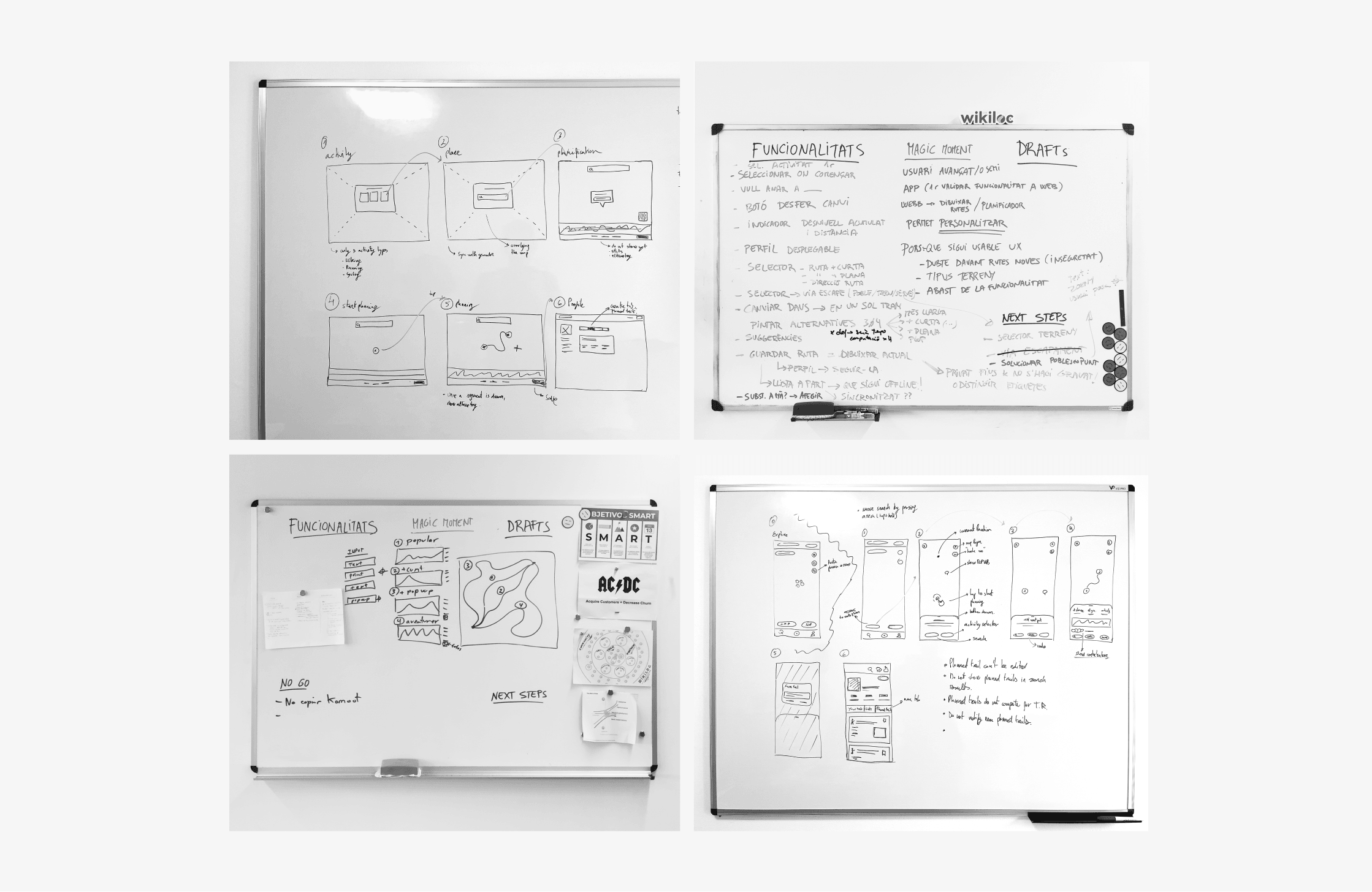
Ideation sketches
I used Jesse James Garrett's Visual Vocabulary to represent the app's main user flows.
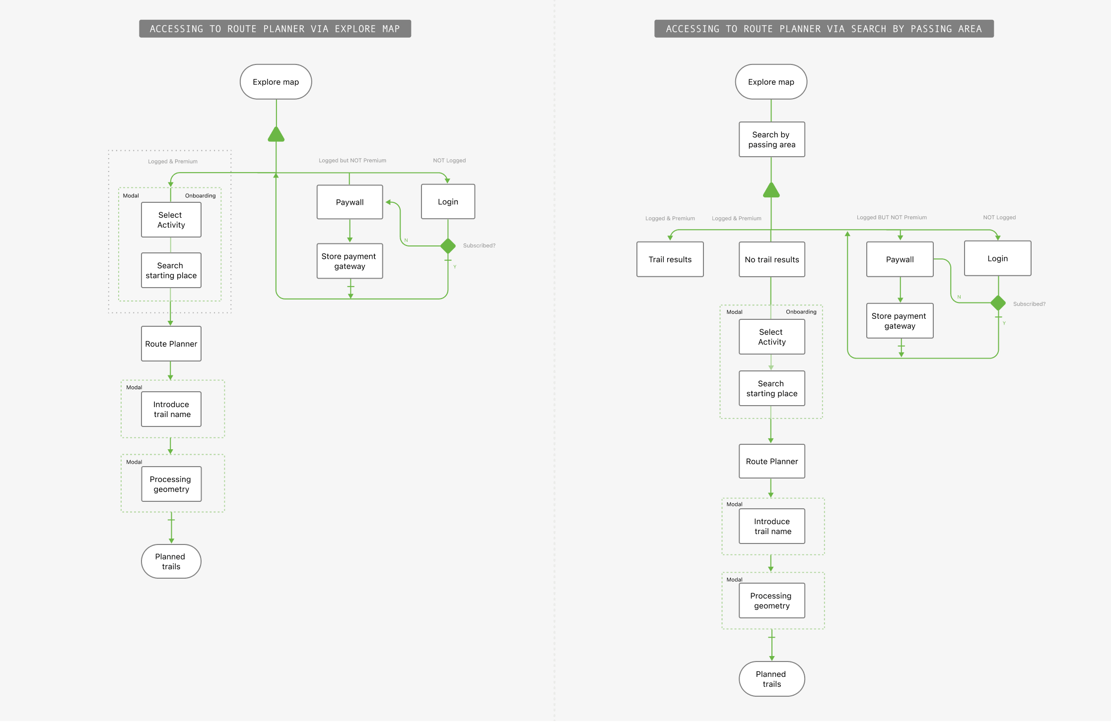
Main Route Planner access flows
PROTOTYPING
After the initial ideation phase, the design began to take shape. I refined the wireframes, established the initial feature layout, and created a solid foundation to build on.
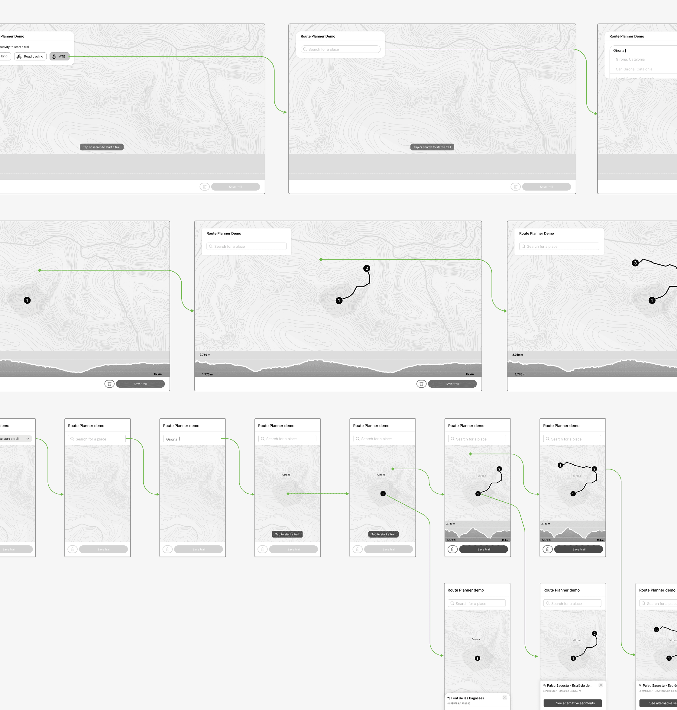
I worked alongside a platform engineer, and within about a month we had a functional web-app prototype ready to test. The plan was to validate the web version first and use what we learned to shape the final web and native-app experiences.
Provisional web-app prototype
USER TESTING
A data scientist and I arranged an unmoderated usability test and a survey with 30 Wikiloc users.
"Remote usability testing allowed us to reach participants around the world."
I ran the remote usability test with Loom, allowing us to reach participants around the world and gather insights from a more diverse sample.
We wanted to assess both the tool's overall usability and the reliability of the routing API, as there were concerns about its performance. To support this, we complemented user tests with a short survey to gather qualitative insights about user behaviour.
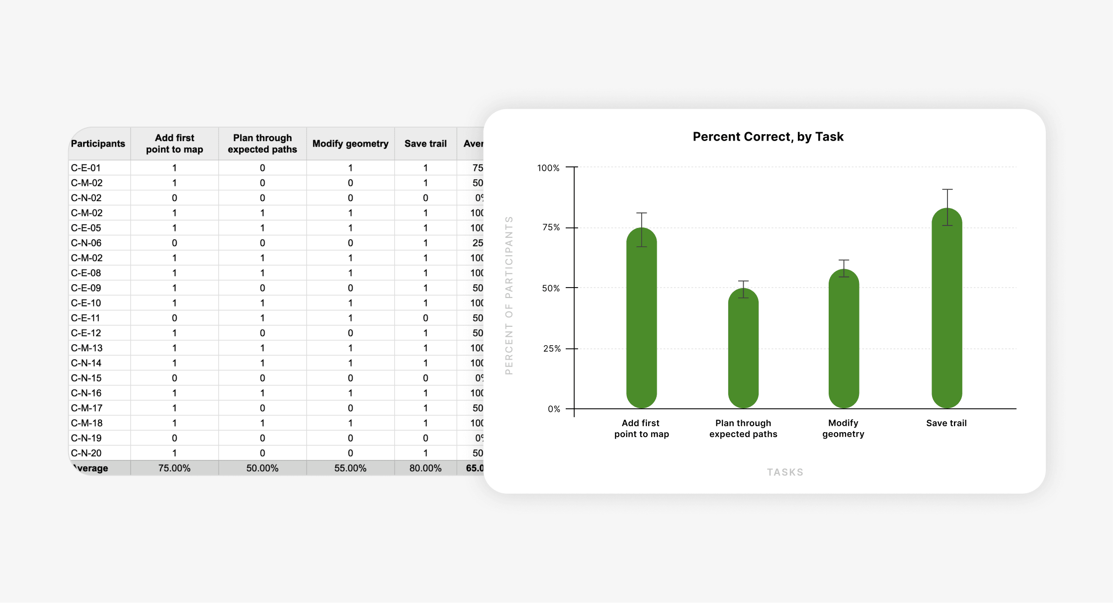
Binary task-success rates with an 80% confidence interval
Overall, we were satisfied with the feedback on the planning experience. Participants found the tool easy and intuitive, and most felt comfortable with the point-by-point routing interaction. However, synthesising the test results revealed several opportunities for improvement:
THE REFINEMENT
Testing was just the beginning. We used the findings to refine the experience, addressing routing quality, onboarding, and the interface before launch.
User-test feedback revealed that the routing engine did not perform as well as expected in certain regions.
We had not identified this issue earlier because the Wikiloc team had tested the tool mainly in Spain, where trail density is high and the results were relatively good. Performance was less reliable in other geographic regions.
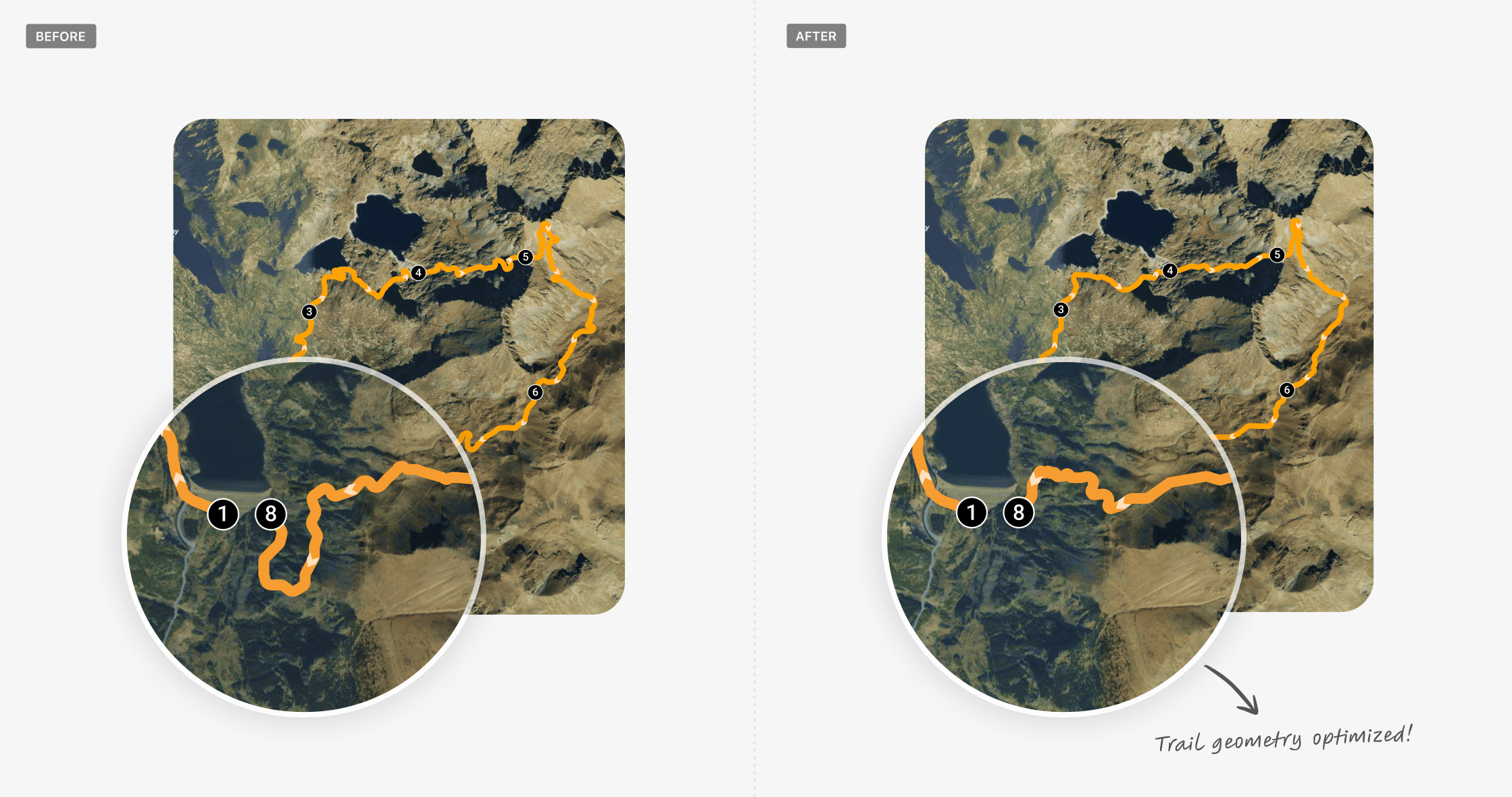
Routing results before and after improving geographic coverage
One key principle was giving users enough geographic context. At first, we tried a detailed onboarding flow, but many participants found it heavy and unnecessary. We reduced the number of steps and introduced contextual hints during planning to guide users more smoothly.
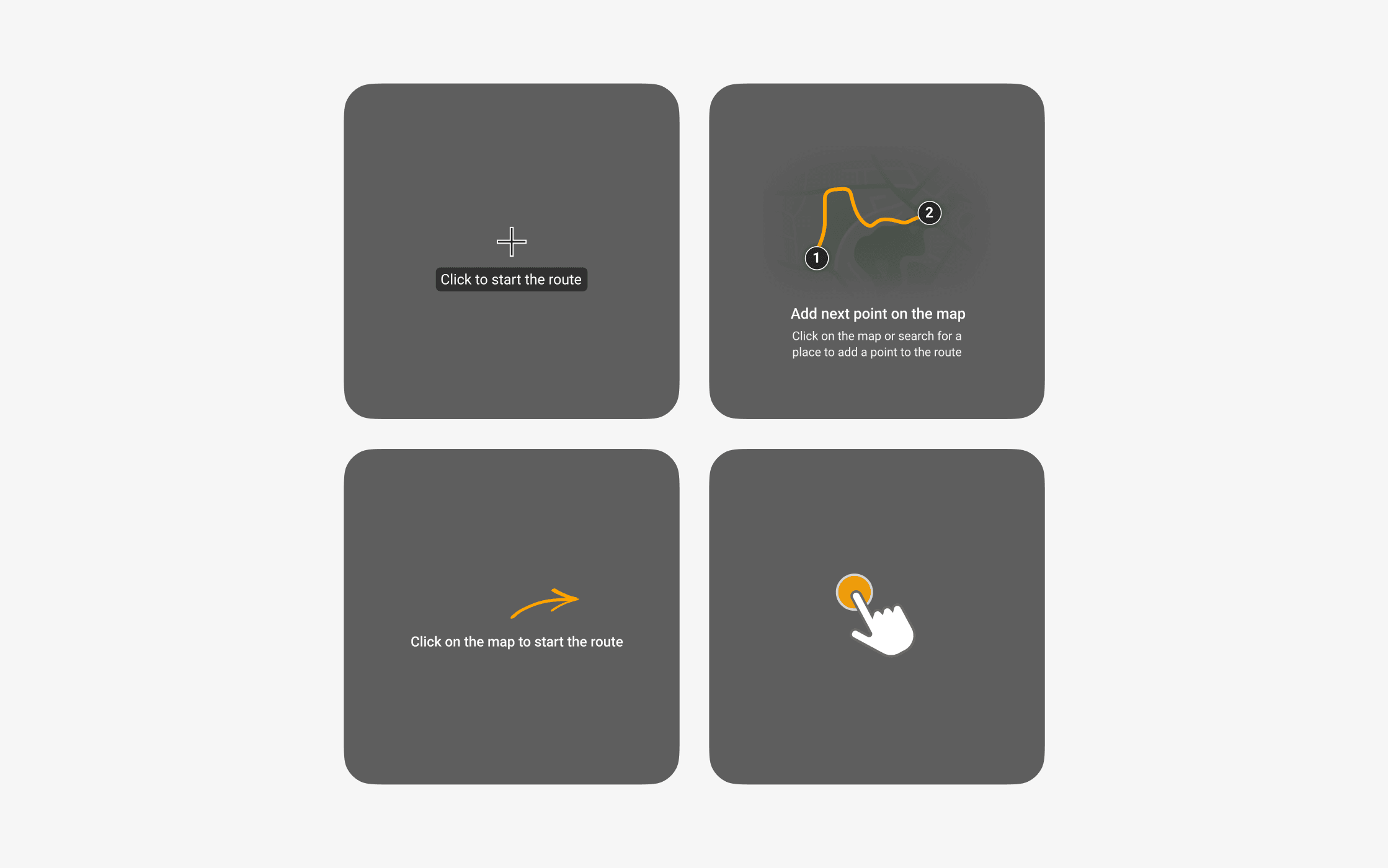
Contextual guidance replaced the initial multi-step onboarding flow
Due to time pressure, the initial prototype had received limited visual refinement. Participants noted that the map felt cluttered and that its controls lacked a clear hierarchy.
We reorganised the interface around the user's mental model and created a clearer visual hierarchy by separating primary and secondary actions.
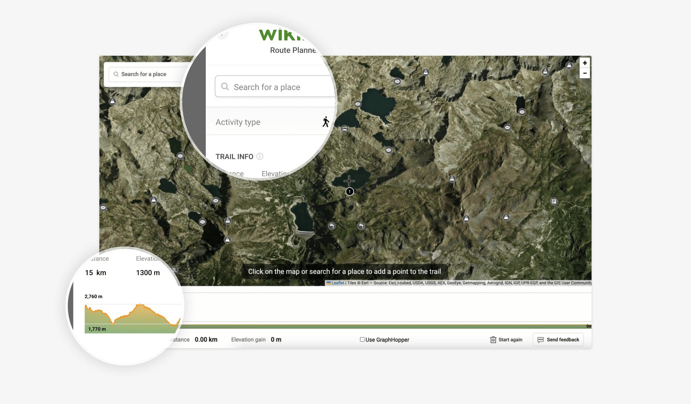
A clearer hierarchy for primary and secondary planning actions
I documented the design requirements—including mockups, scenarios, navigation flows, and user stories—to support the development process.
With these improvements in place, we were ready to launch.
THE LAUNCH AND RESULTS
Nine months after the project began, we launched the Route Planner on 1 July 2024.
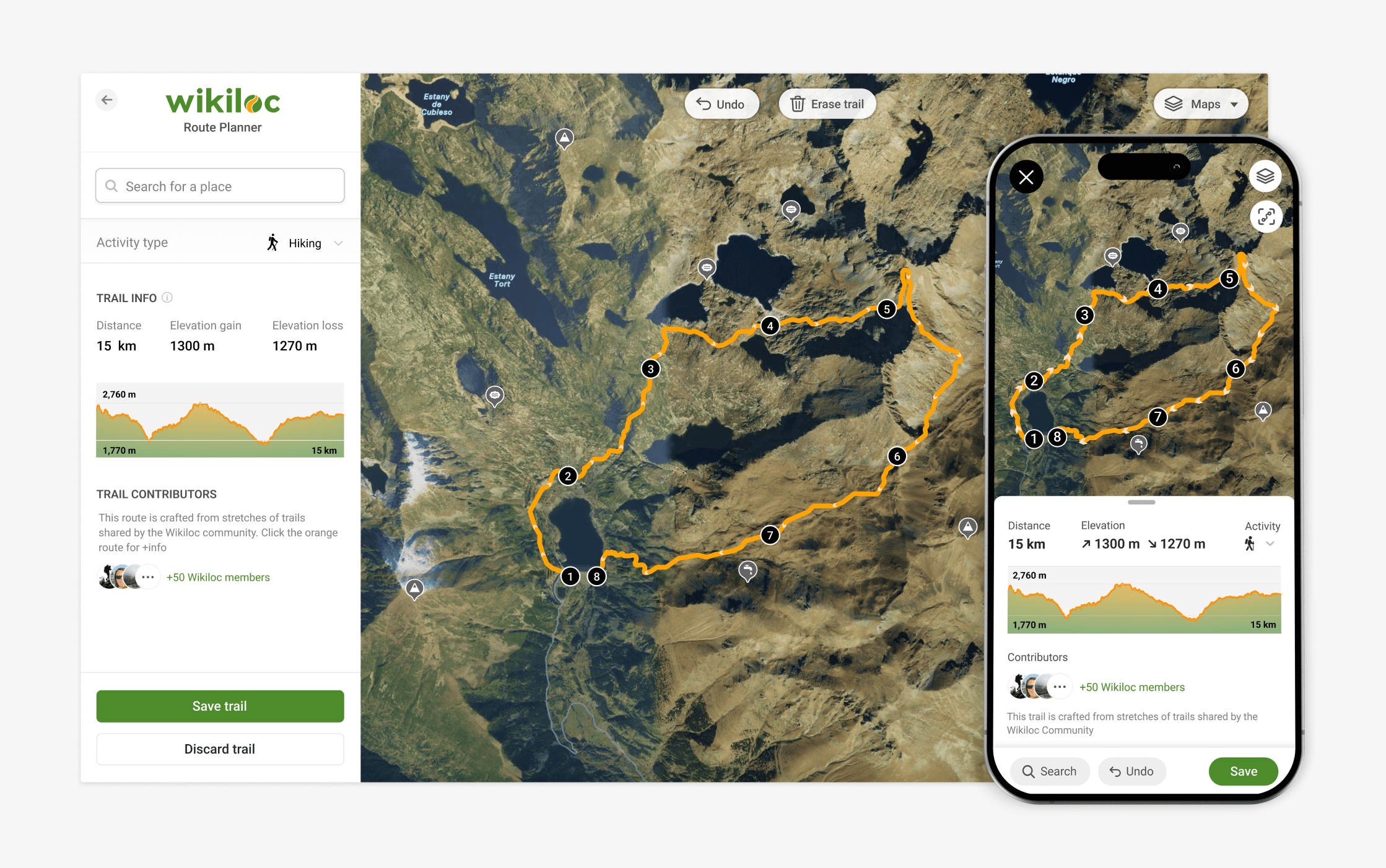
Final web and mobile designs
We replaced the previous onboarding flow by taking users directly into the planner and providing contextual guidance as they progressed.
Wikiloc Route Planner native app – Onboarding
Wikiloc Route Planner native app – Search
We introduced a “drag-to-change” feature that allowed users to drag a section of an existing route to modify its path. By tapping the first or last waypoint, users could also connect both endpoints and close the route.
Modifying a planned route with drag-to-change
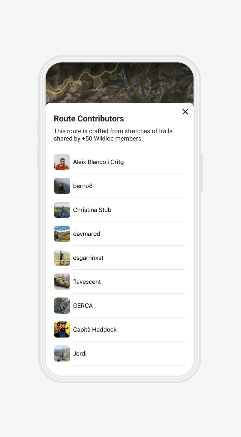
Contributors behind the community trails used to plan a route
IMPACT
The Route Planner quickly proved its value to both users and the business. Within weeks, it became one of the most-used Premium features. Since launch, the community has planned millions of trails, making the Planner one of Wikiloc's strongest Premium conversion drivers.
Top-performing Premium conversion driver
Millions of trails planned since launch
Tens of thousands of Premium conversions
*Results are expressed in broad terms to protect confidential business data.
Beyond adoption and conversion, the Planner strengthened Wikiloc's Premium proposition ahead of a significant, long-planned subscription price increase. Delivering clear, tangible value was essential to maintaining the community's trust through that transition.
FINAL THOUGHTS
From a product-design perspective, I attribute the success of the project to two main factors.